Role
Product Design
focus
User flow
Design system
Product Strategy
Timeline
2024 (Original)
2026 (Revisited)
Bask was a social event platform for Gen Z, built around the idea that there's always a reason to throw a party — whether you're pulling out your mom's china for an afternoon tea, or making it big at a wedding. This is the RSVP guest flow and the design system built to make every event's visual identity carry through to the guest experience.
project note
I designed the RSVP guest flow as part of the core product team in 2024, working alongside the Fusion Motive team. The flow was designed in full scope but not carried through to production — the project pivoted to a minimal MVP before implementation. This case study revisits that work to apply the design system layer it was always missing.
intro
RSVP and the jobs it needs to do
The organiser needs a lot of information — guest names, dietary needs, transport preferences, WhatsApp group. The guest wants speed and zero friction. The challenge was to serve both without compromise: a form that collects everything the organiser needs while feeling, to the guest, like it takes thirty seconds.
But guest need isn't only speed. Many guests carry a quiet worry "has the organiser thought about me specifically?" The vegetarian wonders if there'll be food. The parent wonders if children are welcome. Open fields over predefined options signal the opposite: your situation is welcome here, whatever it is.
I decided to take this further with a token-based design system — because it was the right answer to a third need, one neither party notices until it's missing: coherence. When the RSVP form inherits the visual language of the event template, the guest experience feels like one thing, not two. The host's personality carries through to the moment of response.
Problem
The form belonged to the app, not the event.
Every event on Bask has its own visual identity. But the RSVP form was styled once, statically — a birthday bash and a pasta night looked identical to their guests. The form belonged to the app, not the event.
I looked at it through a Jobs-to-be-Done lens: the guest needs to confirm attendance quickly and have a voice over their needs. The organiser needs to know precisely who's coming, with whom, and what arrangements to make, without chasing anyone. A static, one-size-fits-all form wasn't serving either.
Hypothesis: if the form inherits the event's characteristics automatically and collects the right information upfront, both the experience and the logistics take care of themselves.
STARTING POINT
The flow, before the system
First-draft wireframes from the Bask project, 2024. The full scope covered multiple flows and edge cases. What you see here is the happy path. The thinking behind each screen is covered in the design decisions below.

DESIGN DECISIONS
What was decided, and why
Removing the intro copy. The original wireframes opened with "Let us know if you're coming and answer a few quick questions to help us plan." It was cut — the screens are self-explanatory.
"You in?" as the opener. A bold move for a minimal flow, but it sets the tone immediately and removes any ambiguity about what the guest is being asked to do.
No Maybe. A maybe as an option creates uncertainty for the organiser without giving the guest anything useful. The RSVP is a commitment, not a mood, so the options are yes or no.
The invitation encodes the context. The invitation type — named group, plus one, open list, solo — determines what the RSVP form asks. The organiser's intent is expressed once, and the form already knows what to present. No redundant questions, no confusion.
The flow below is for groups. If the organiser selects a plus one invitation, the guest checklist screen adapts — instead of pre-filled names, the guest types their companion's name directly.
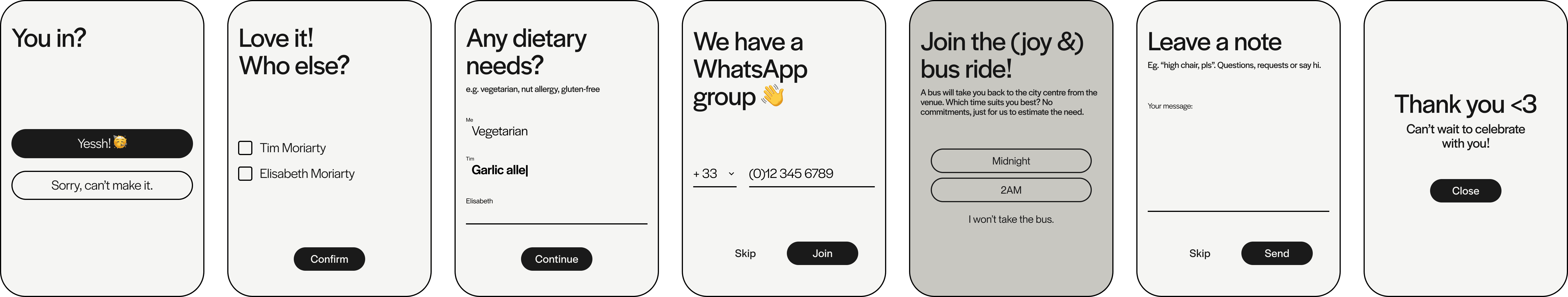
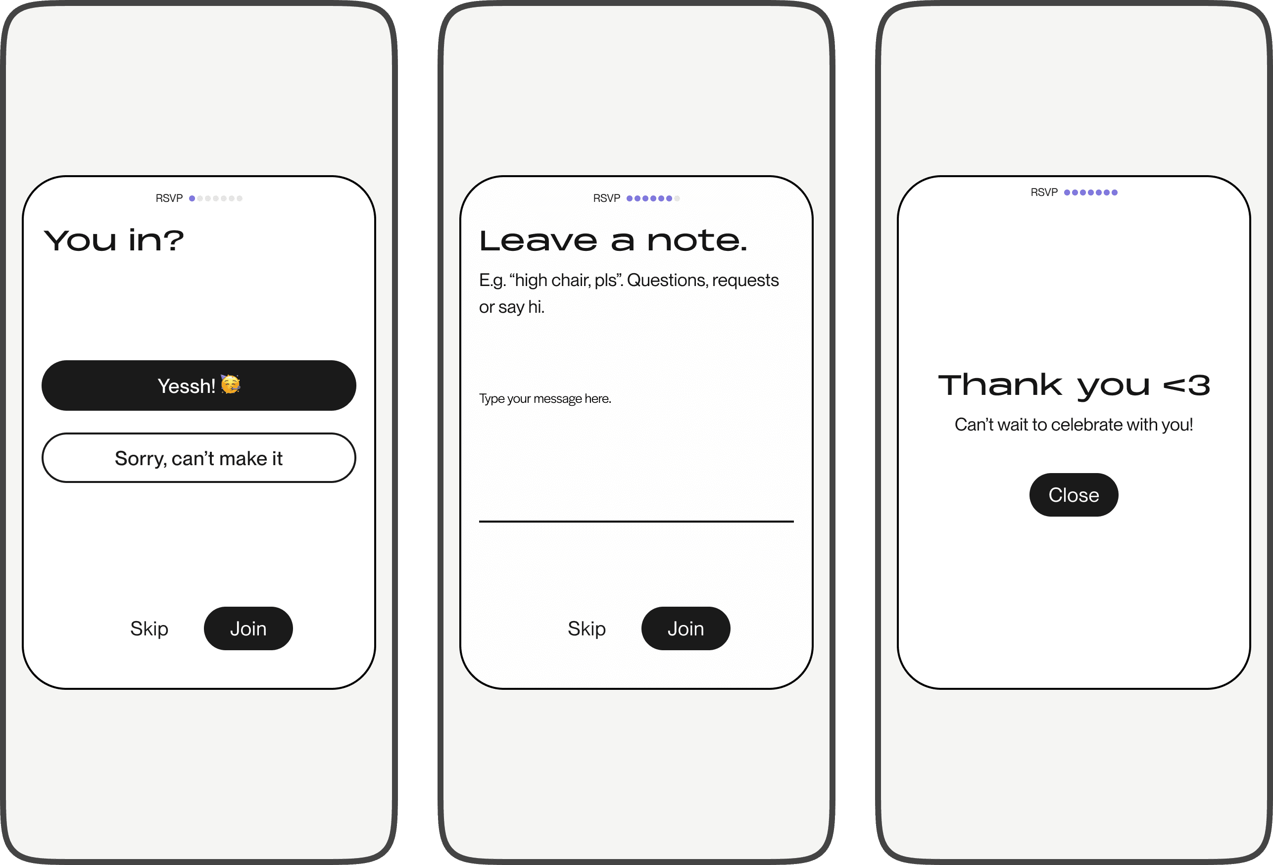
The form moves at the guest's pace; decisive taps advance automatically, open inputs wait for them. No back button, no pressure. Skip is always there, just quieter.
Dietary needs as free text, not a checklist — because nobody wants to be left without food. People know how to express their own needs; they've done it at restaurants repeatedly. An open field with examples gets richer data than a checklist that grows long and still misses something. For set menu events, the organiser can add a screen with predefined selection, e.g. fish or meat.
Optional screens. The bus ride screen shown in this flow is an example of the organiser using the back office to gather specific information with an open answer field. Polls and additional input types are on the roadmap.
The thank you screen breaks the layout rhythm intentionally. The flow is task-dense. The final screen earns its breathing room as an emotional beat rather than another form to complete.
Edge cases consciously deferred. If the primary guest can't attend but someone else goes in their place — both, happy and sorry flows include free message fields to handle this, even though choosing the answer is admittedly a difficult call for the user. Designing for 2% of users at the cost of clarity for 98% is the wrong trade.
EXECUTION
The default state
The default theme is intentionally neutral. No event identity applied, no template bleeding through. Clean type, black and white, full contrast. It's the base state the system builds from — every themed version starts here. One addition made after the wireframes: progress indicators. Even when the flow is short, nobody likes to feel lost.
THEMING
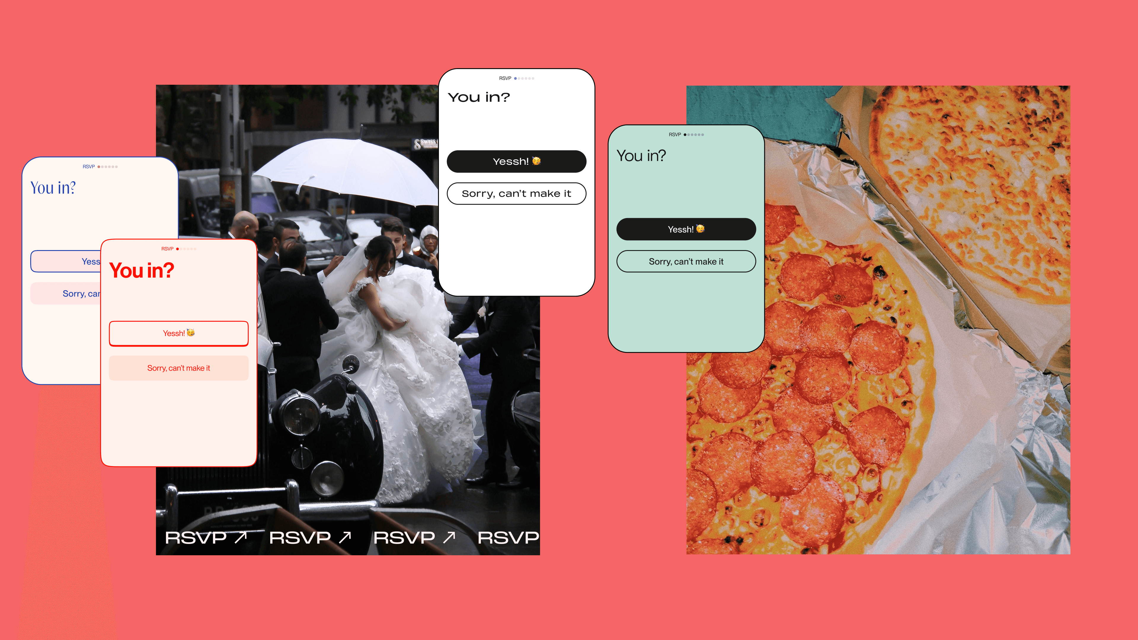
One form. Every event's identity.
Button hierarchy shifts with the theme. In the default state, yes is filled and no is outlined. In party mode they swap. The primary action changes with the mood of the event, not just the colour.
The display text "You in?" is set as a text style per theme to match the event's typography. Figma doesn't support typography variables yet, so text styles handle this layer for now.


TEMPLATES
Each template drives the form
Event templates are the starting point for every Bask event. The organiser picks one — it sets the visual language of the invitation and carries through to the RSVP form automatically. No custom styling per event, no inconsistency.
Each template comes with colour schemes to choose from. The text and images are fully customisable, so any template can work for any event type. The structure does the heavy lifting — the organiser just makes it their own.
A couple of templates shown here. Each one is a different mood, a different colour world — same underlying form.


DESIGN SYSTEM
Built to scale from the root
The system runs on two layers. Primitives hold the raw values — hex codes, numbers, the base palette. Semantic tokens reference those primitives and give them meaning: surface/default, accent, radius/card. When a theme changes, only the semantic layer updates. The primitives stay untouched.
Colour, corner radius, and spacing are all token-driven. Add a new theme and the form inherits it — no per-event styling. Components are built once and themed through tokens; so the button doesn't change, only the values it references do.
Design systems make ambition scalable. When aesthetics are defined as tokens, changes apply everywhere automatically and variations are easy to build. The same naming convention in design and code removes the guesswork from handoff — and keeps the system AI-ready and open to whatever comes next.

reflection
did it hold?
The hypothesis was that a token-driven form inheriting the event's visual identity would serve both the guest and the organiser without extra work from either. Based on the design: yes. The guest moves through a form that feels like a continuation of the invitation. The organiser gets the right information, configured once, without follow-up.
What shipping would have proven is 1) whether the coherence between invitation and RSVP reduced drop-off, and 2) whether organiser-configured screens reduced the need for manual guest coordination. Drop-off rate could be measured through funnel analytics, and organiser follow-up behaviour through post-event surveys or in-app messaging data.


